Responsive Website Designers
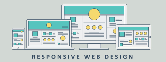
Responsive web design (RWD) is a web design approach aimed at crafting sites to present an optimal viewing experience, easy reading and navigation with a minimum of resizing, panning, and scrolling across a wide range of devices ranging from mobile phones, tablets to desktop computer monitors. A site designed with responsive website design adapts the layout to the viewing environment by using fluid, proportion-based grids, flexible images and CSS3 media queries, an extension of the media rule. When a website is responsive it means mobile friendly, it will automatically adjust to the screen size of any device, say a mobile phone. It will consume the loading time and improve the performance of the website. All Internet users do not access the Internet only through their desktop or laptop computers with a normal resolution. Time has changed and it is time for us to change according to the time.
